ux design / client project
Designing for Trust: Web Redesign
Responsive Web Design

role
Sole UX Designer/UX Writer working with external marketing team
PRODUCT
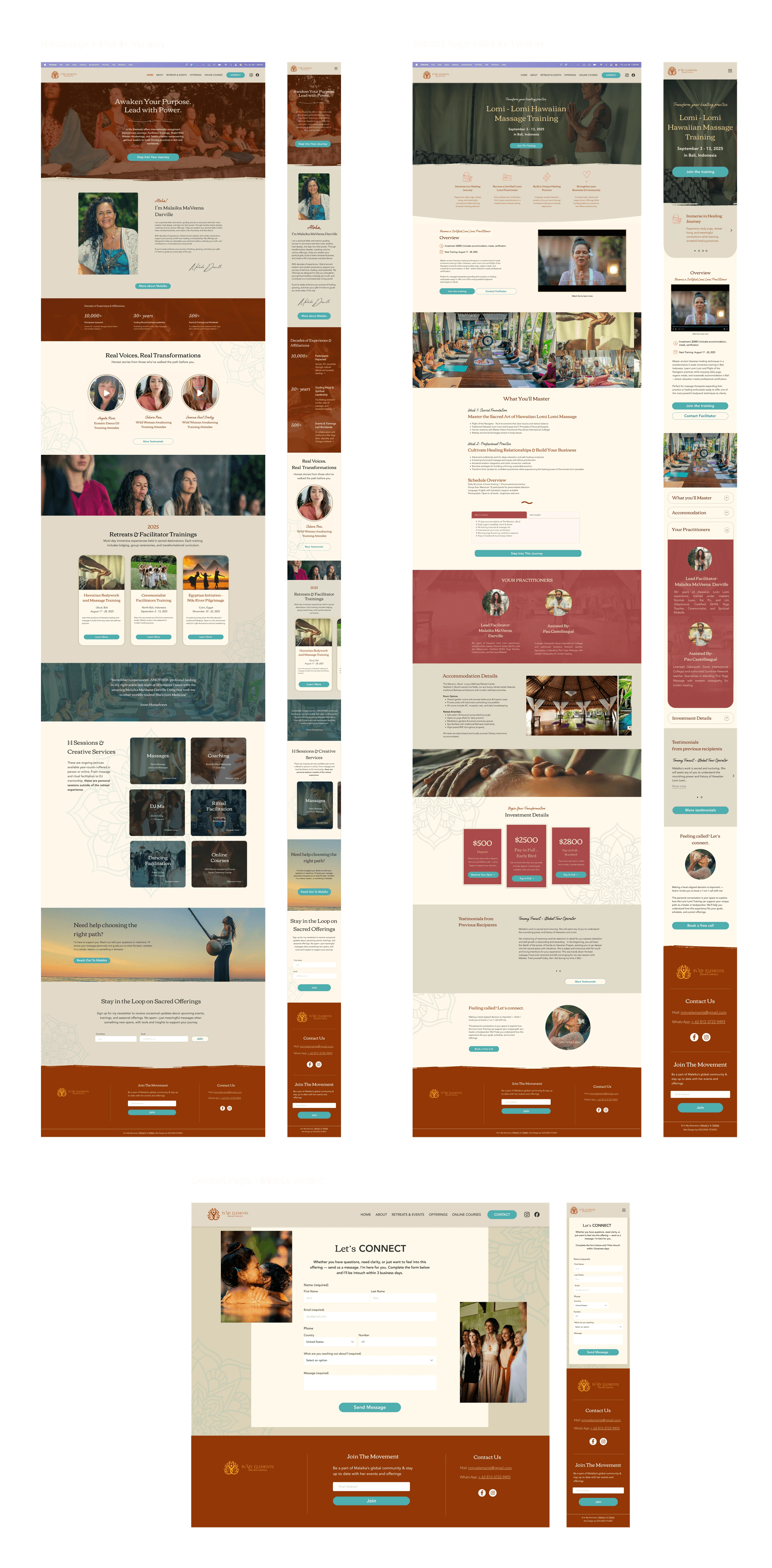
Responsive Website + Mobile designs
tools
Figma, FigJam, Lyssna, Google Suite, Wix
when
March-April (4 weeks)
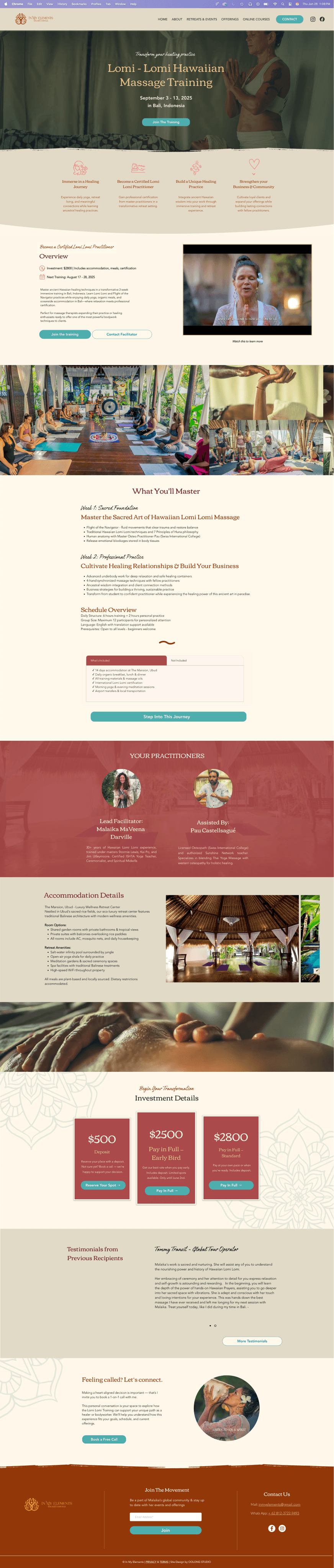
From Scam to Trust: Why Qualified Wellness Seekers Were Abandoning the Booking Journey
Problem
Users encountered poor usability, unclear content, and visual misalignment that failed to reflect the transformational nature of the wellness retreats.
the challenge
How might we design a trustworthy and inspiring digital journey that empowers wellness seekers to confidently evaluate and commit to transformational retreat experiences?
success metrics preview
I will be focusing on gathering the attitudes based on their experience.
Trust- Evaluating attitudes on whether the website felt credible & professional
Inspiration - Whether users were inspired to take action after viewing website
Usability - If users were able to complete tasks on the website

research:
user interviews
Uncovering the Hidden Decision-Making Patterns of Wellness Retreat Seekers
Key Insights:
Trust Builders: Personal facilitator presence, transparent pricing, authentic testimonials
Pain Points: Information overload, aggressive sales copy, unclear value proposition
User Needs: Transparent journey, emotional connection, clear logistics
Primary Pain Points:
Lack of clarity about value and what's logistically included
Feeling pressured by aggressive sales language
Information overload causing decision fatigue
No option for human interaction when needed
User Needs:
Transparent journey through the offerings
Emotional connection through authentic visuals and community energy
Clear logistics alongside inspiring content
Accessible facilitator presence
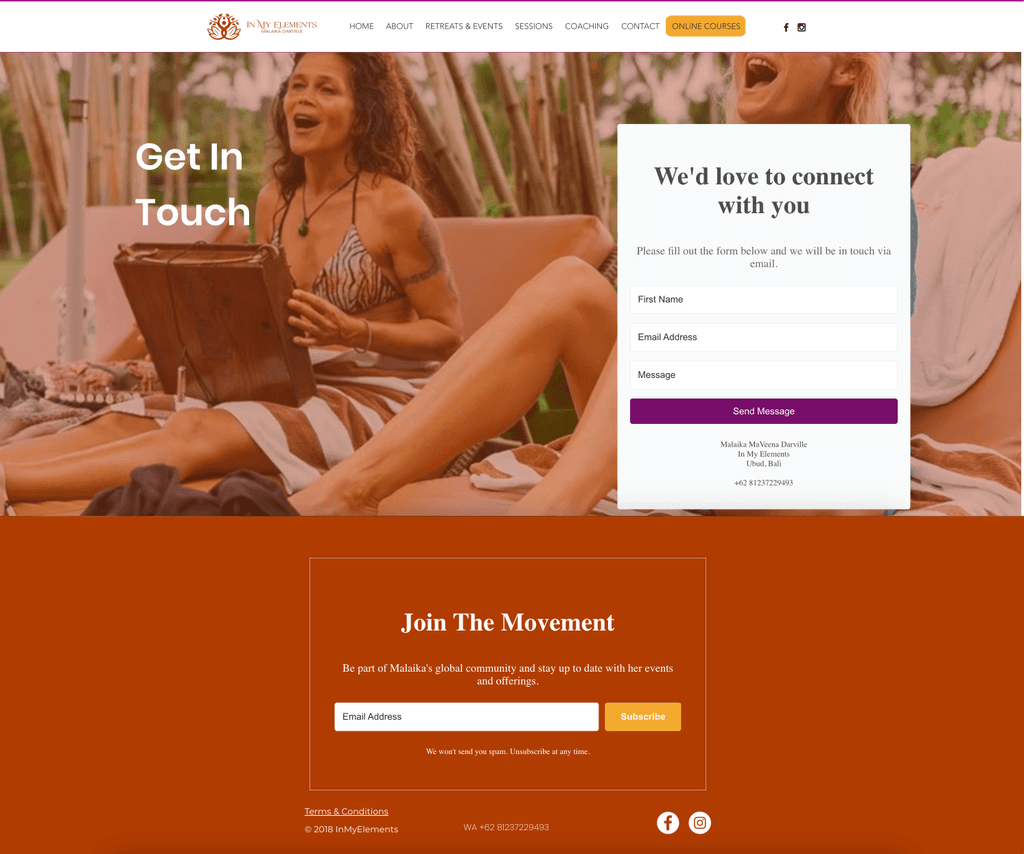
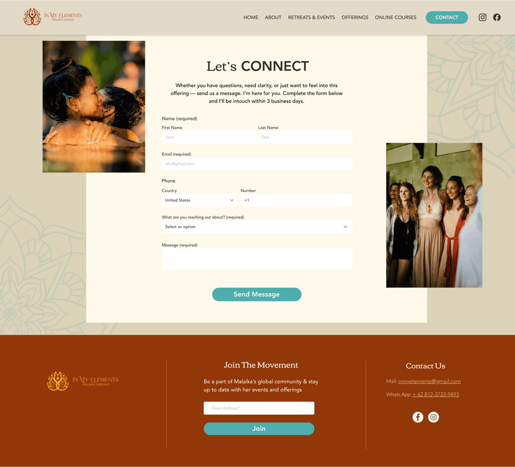
Crafting an intentional user journey through Establishing Design Values:
Be Authentic
Show real stories and honest information to build credibility
Create Curiosity
Make users excited while providing necessary details
Guide the Journey
Support users from first visit to booking
Make it Accessible
Everyone can easily explore and understand offerings
Content Strategy - "Keep it skimmable with context right after - along with CTA"
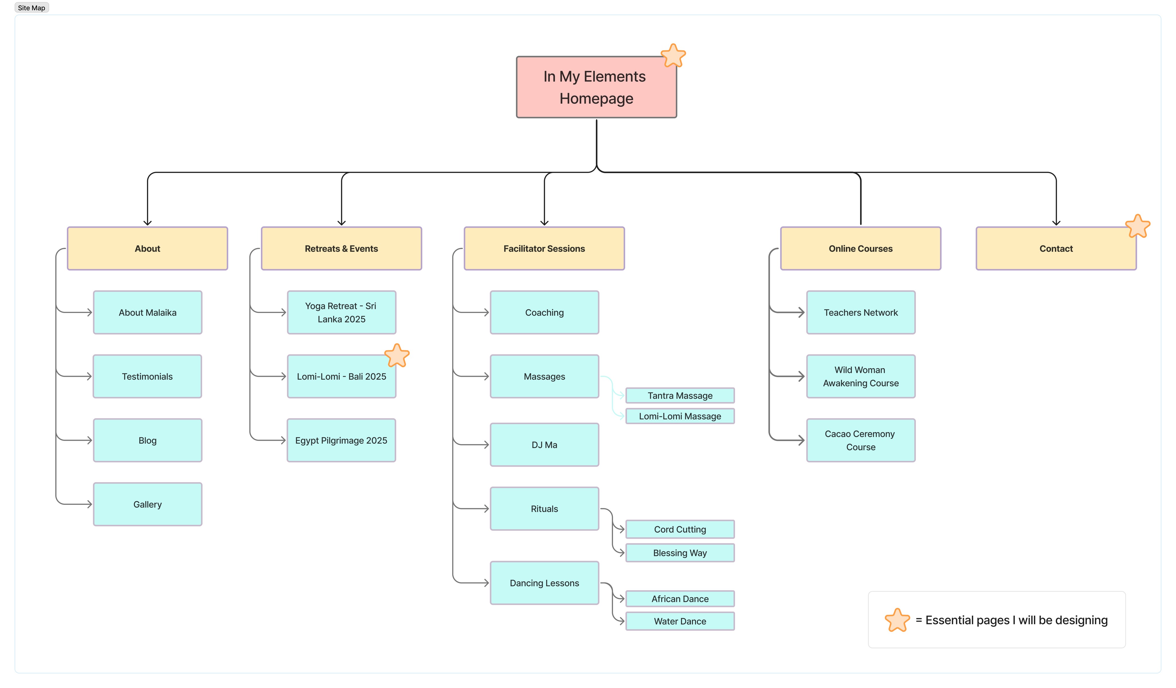
Site map
Turning Constraints into Creative Solutions
Technical Limitations
Working within Wix's constraints meant keeping interactions simple and focusing on clean, buildable UI elements. The marketing team's limited technical knowledge required designs that could be easily implemented without complex custom code.
Stakeholder Collaboration
Challenge: Balancing marketing goals (selling) with user needs (learning and feeling confident).
The marketing team initially pushed for:
Sales-heavy copy that users found "pushy"
Bright, overly creative visuals that could overwhelm casual browsers
My Advocacy*
Useful user flow, beneficial for me and the marketing team
Method: Card Sorting with Retreat Veterans
low fidelity wireframes:
content concepts to design
test #1:
usability feedback
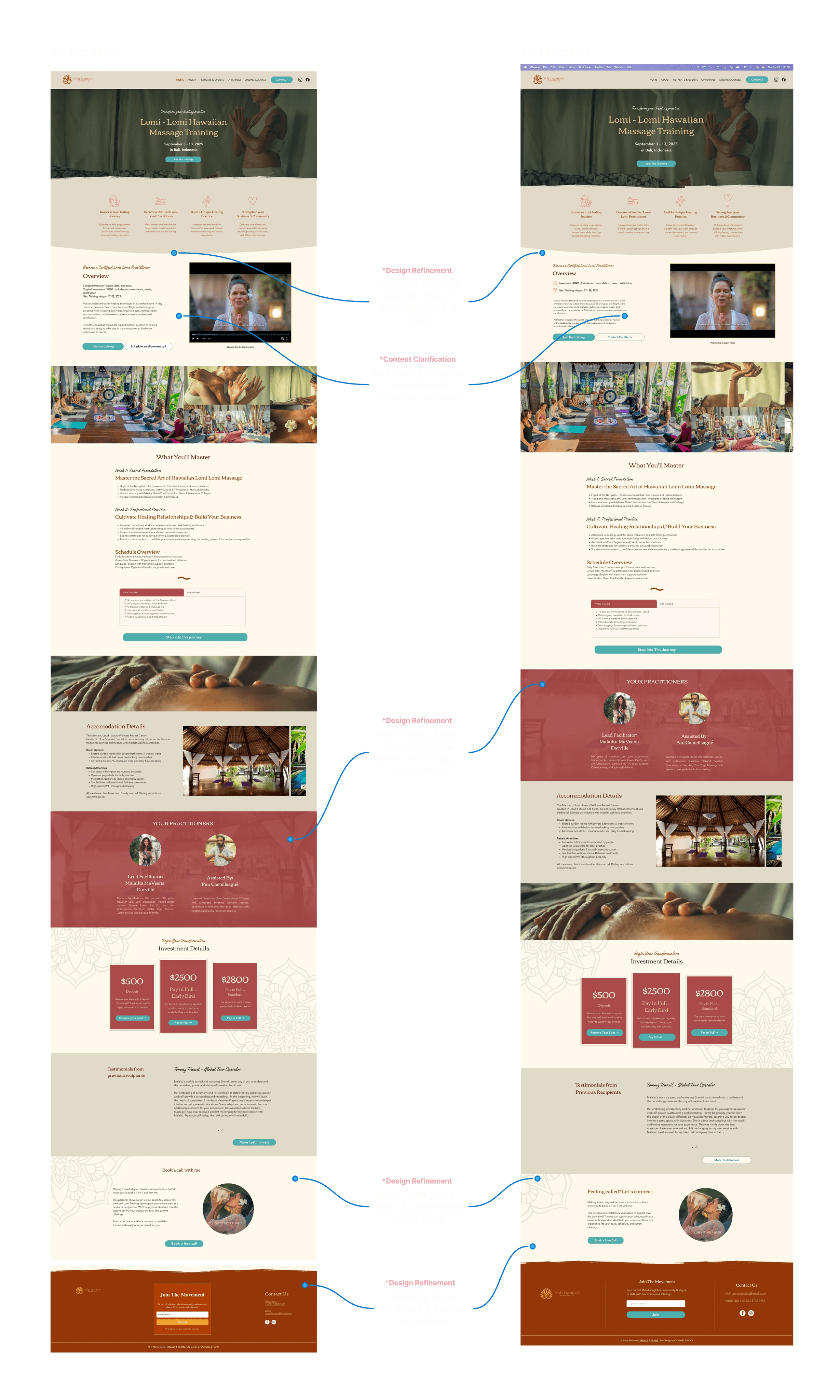
Measuring What Matters: How Strategic Design and Content Strategy Tripled User Trust
Iteration Priorities:
Social Validation Enhancement
Add facilitator impact metrics and contextual labeling to testimonials, identifying speakers as past participants for stronger credibility.
Content Clarification
Refine UX writing and add subtext throughout to reduce user confusion about retreat offerings and next steps.
Design System Refinement
Implement UI tweaks to create clearer visual distinctions between different retreat offerings and content sections.
results & impact
From 1.5 to 4.5: The Quantifiable Impact of User-Centered Design on Booking Confidence
💬 Gerald, User Testing Participant
Real Quote from the Usability Testing
Reflections
What I Learned
Client Aesthetic vs. User Experience: The client wanted extensive color usage throughout the site. I balanced this by establishing a hierarchy that used color strategically while maintaining accessibility standards and visual clarity.
Next Steps
Crunched on time, the mobile version was built off the main design of the desktop version. I would want to test the mobile version with the same participants, but focus on usability.